Concept DP
Creative Brand Identity
Overview
Concept design and printing is an innovative design and high-quality printing services, based in Tampa, USA, seeking to create a cohesive and visually striking brand identity for Concept DP that reflects its commitment to innovative design and high-quality printing, establishes a strong presence in the Tampa market, and effectively communicates its expertise and creativity to clients.
The Challenge
Design studios operate in highly competitive environments where visual identity plays a critical role in communicating expertise and creativity.
The goal was to create a brand system that feels modern, confident, and design-forward.
Strategic Approach
The brand strategy focused on presenting Concept DP as a forward-thinking creative partner, capable of delivering thoughtful design solutions.
My Role
I was responsible for overseeing the creative direction and identity design, creating a brand system that embodies innovation and modern design thinking.
Design Direction
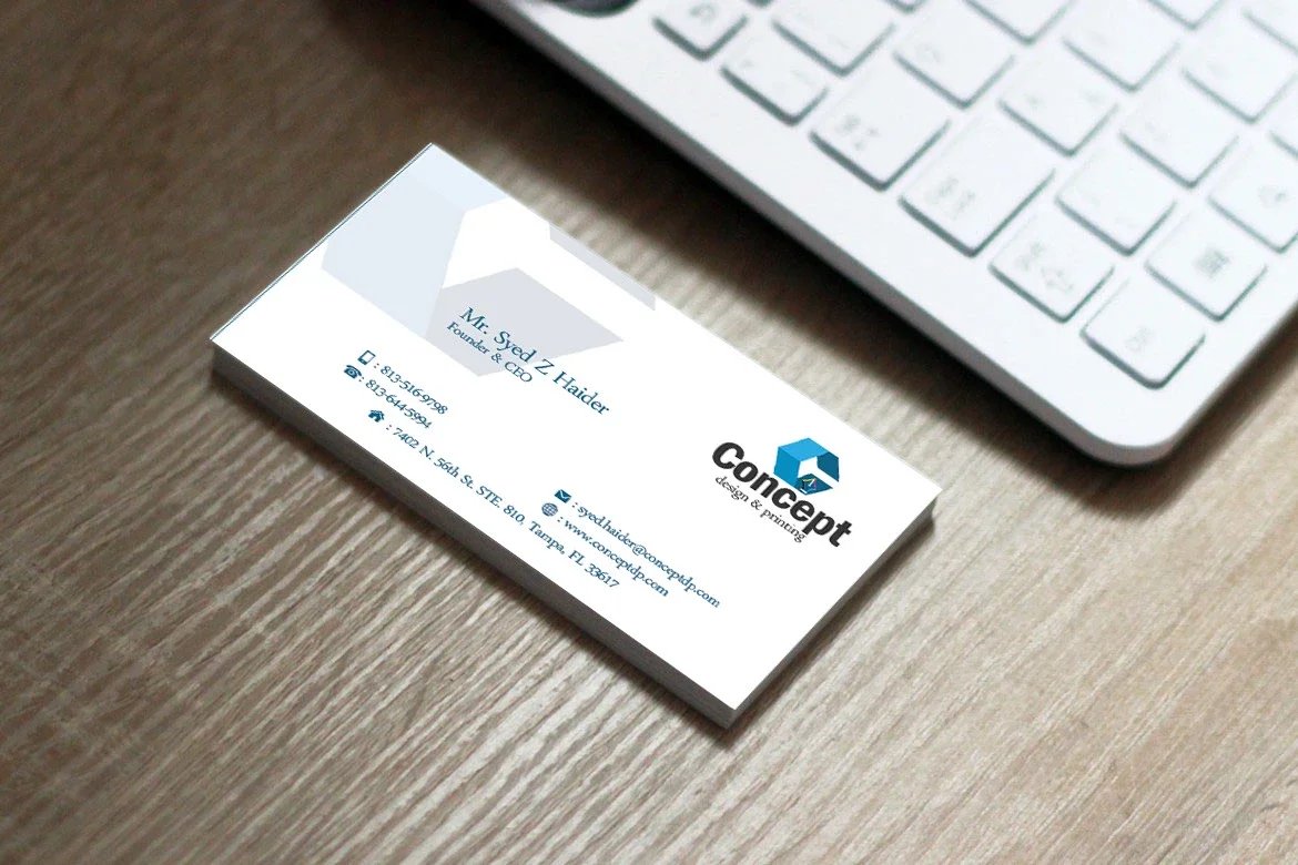
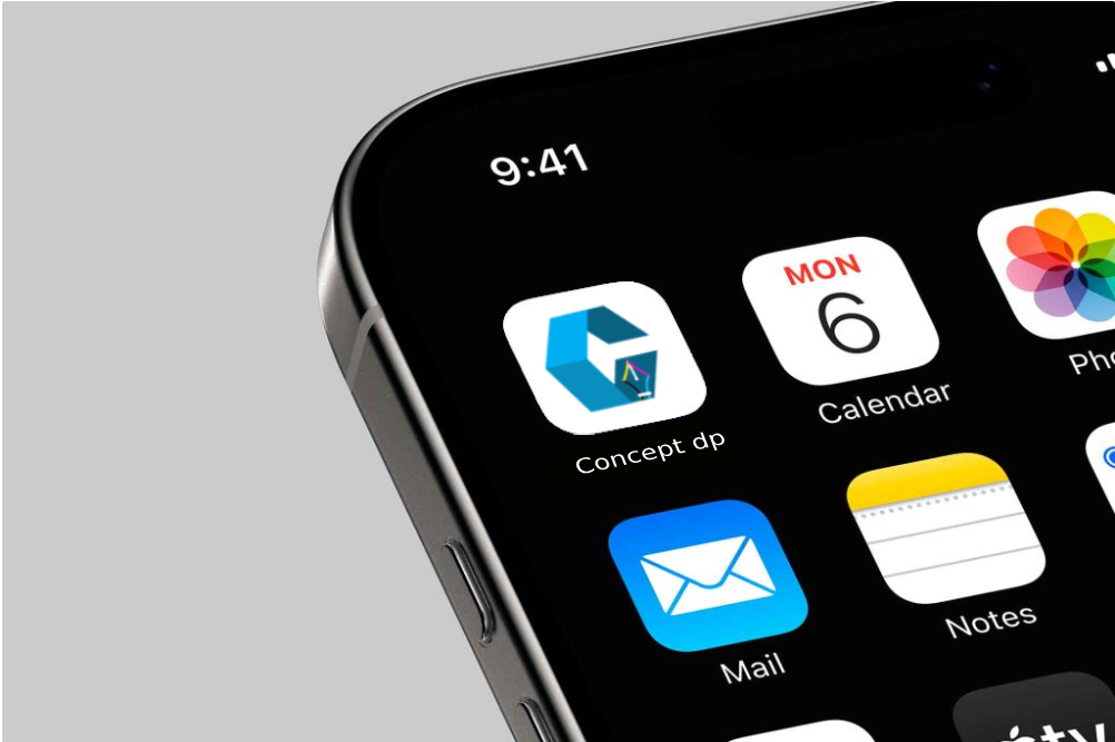
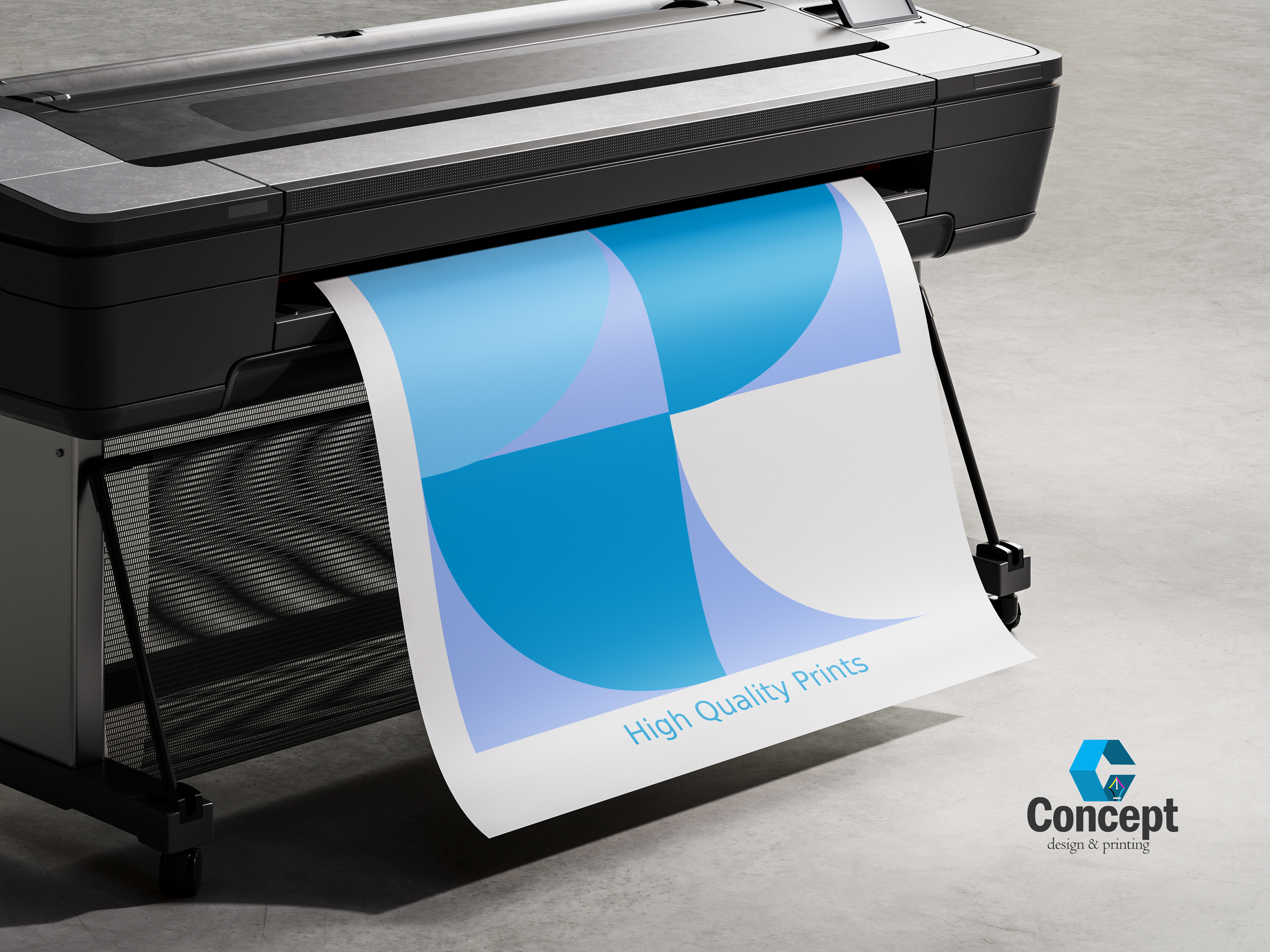
The logo for Concept DP is a geometric “C” shape with a pen embedded within it, signifying creativity and accuracy in both design and print. The use of CMYK colours in the logo represents expertise in print, and the blue and black colours convey professionalism, trust, and contrast. The logo is contemporary, clean, and flexible, ensuring it is easily recognizable across different formats, both in colour and monochrome.

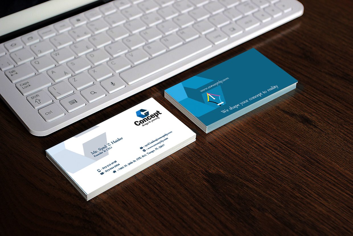
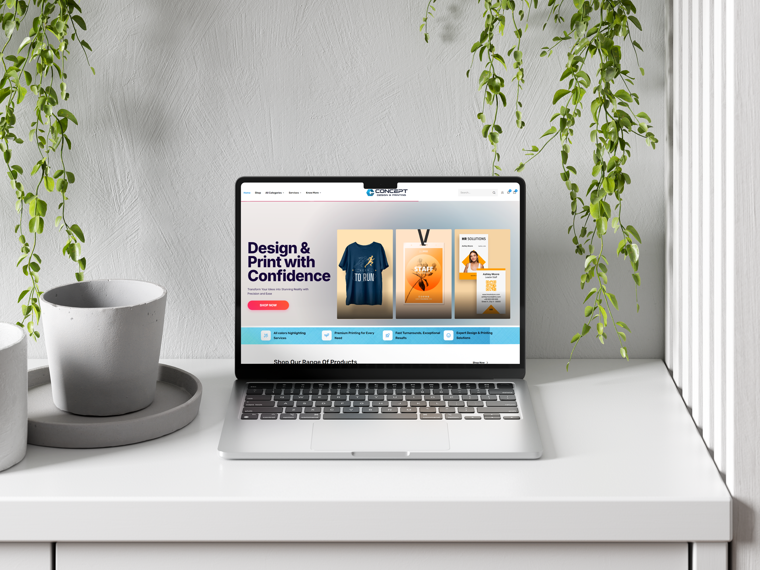
Brand Applications
The identity was extended across:
Brand communication assets
Studio stationery
Marketing materials
Visual identity systems
Each application reinforces the studio’s design-focused positioning.
Measurable Outcomes
Built a flexible visual identity system adaptable across multiple brand applications.
Strengthened brand positioning by presenting the studio as a modern and professional creative partner.
Created a cohesive set of assets that support consistent communication and marketing.