Foona Review
Platform Branding
Overview
Foona Review™ is a food discovery service that helps people find great food choices nearby—using both a search and GPS-mapped locations, seeking to create a modern, approachable brand identity for Foona Review™ that clearly communicates its mission to help users discover great local food through search and GPS, while standing out in the competitive food discovery market.
The Challenge
Review platforms must immediately communicate reliability and ease of use. The brand needed to feel trustworthy while remaining modern and approachable.
Strategic Approach
The brand strategy focused on clarity and usability. The identity was designed to support a platform built on community insight and authentic user feedback.
My Role
I was responsible for branding concepts, logo designs, and a digital visual identity system for the project.
Design Direction
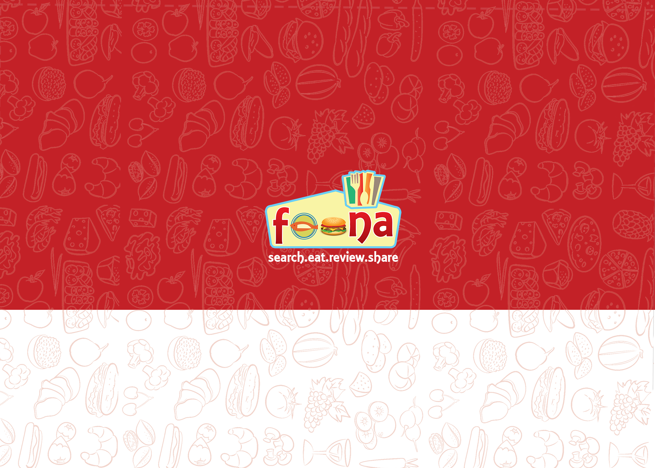
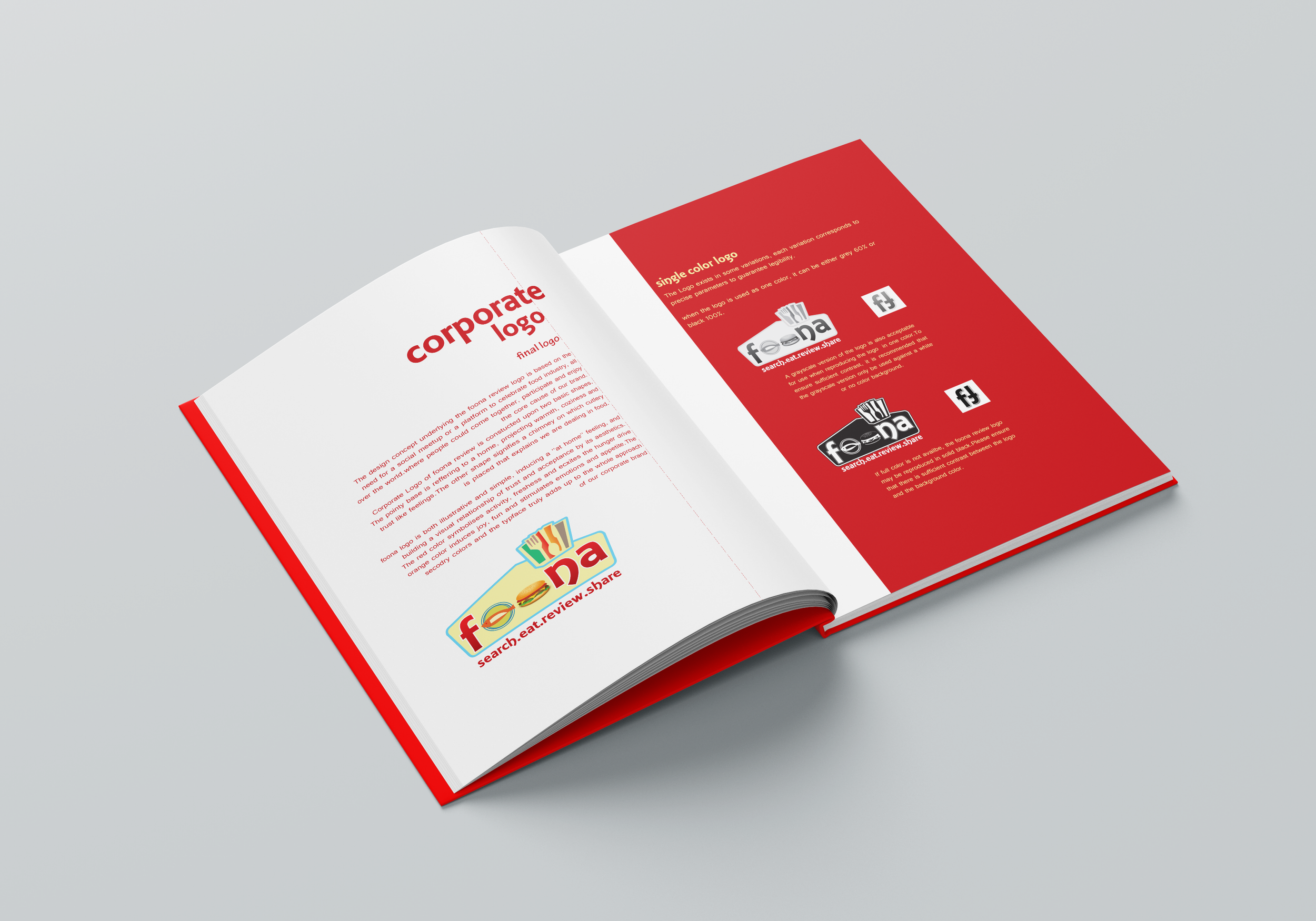
A strong red and white color scheme was used for the design, which stimulates hunger and energy, while keeping the design professional with sufficient use of whitespace. The distinctive cut on the logo represents a food theme, which gives a sense of tactility to the design. A subtle food iconography adds texture without visual clutter, and a clear typography ensures quick reading and business clarity.

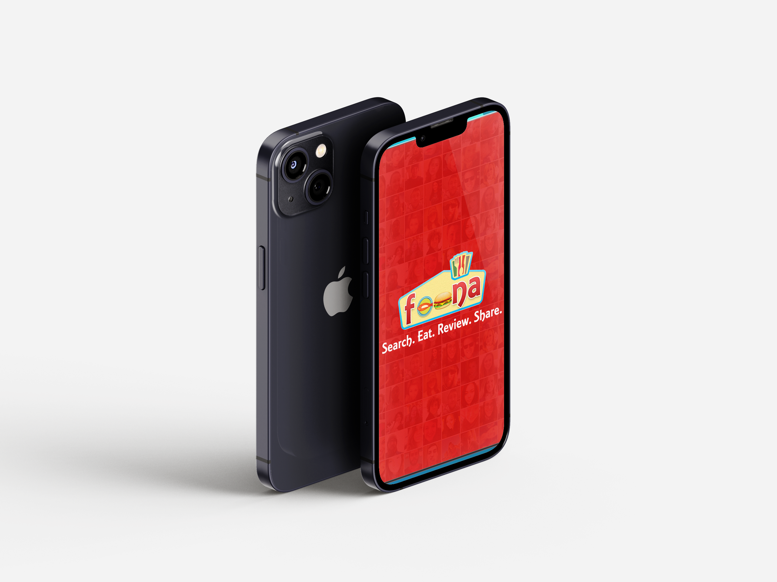
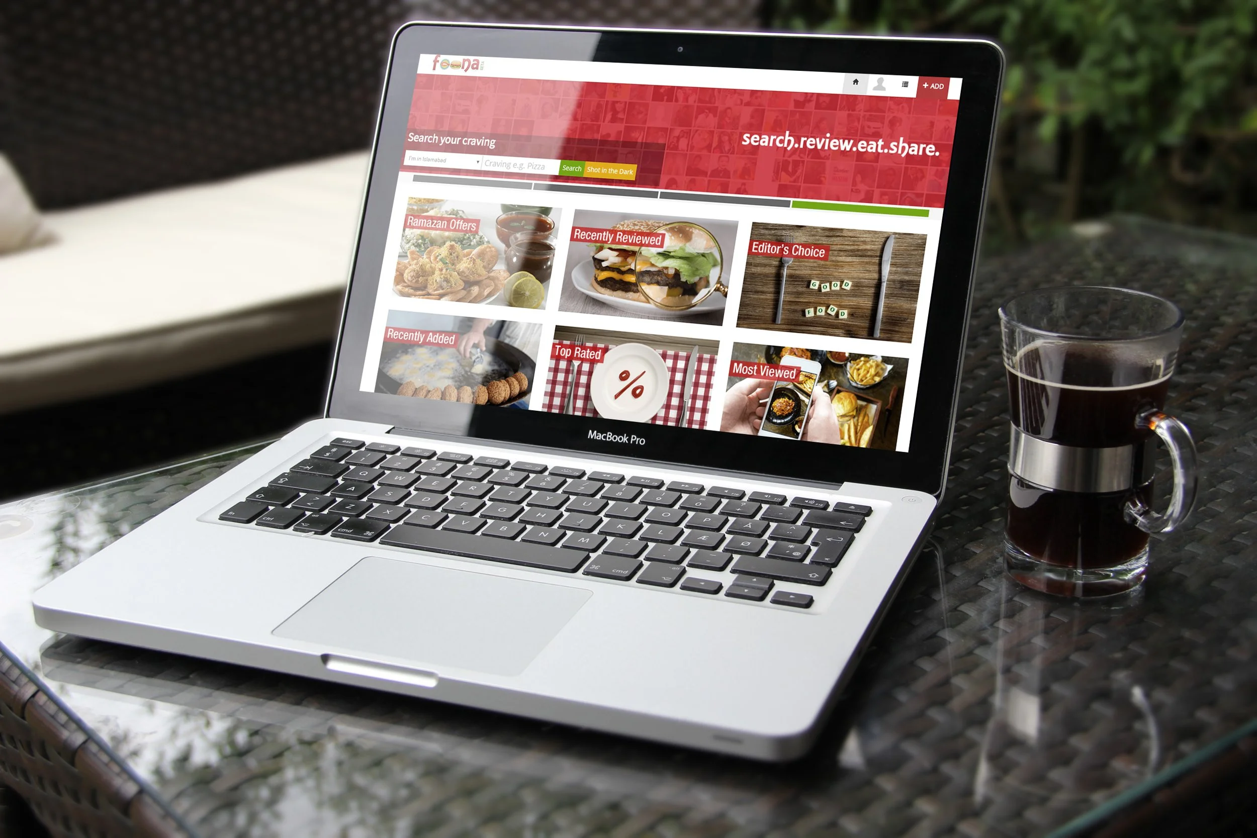

Brand Applications
The brand identity was applied to:
Platform branding assets
Social media visuals
Marketing materials
Digital communication graphics
Each element contributes to a cohesive and recognizable brand presence.
Measurable Outcomes
Created a recognizable brand identity optimized for digital platforms.
Designed brand assets that support consistent marketing and platform communication.
Improved visual clarity and usability through a structured design system.